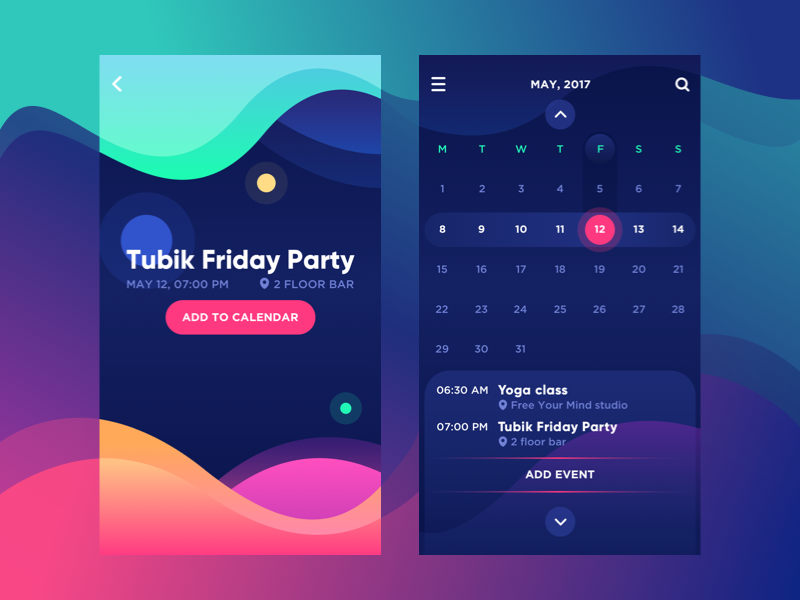
Colours have always played a pivotal role in design, be it in traditional offline settings such as products or online media such as websites. Research has shown that colour impacts the average person’s judgement about a product within the first minute of seeing it. Each colour has its own implications and associations that affect how we feel about a particular visual. As such, a strong knowledge of colour theory as well as consumer psychology can help you to create highly effective websites.
Colour Associations
In the after mentioned two courses of study, colours have been mapped to human feelings and emotions. In this section, we cover common colours’ connotations.
Red has positive associations with passion, energy, strength and excitement. However, it suffers from negative connotations relating to anger, aggression and rebellion. Many brands use red as their primary colour to stimulate appetite, create urgency and drum excitement. Examples include Coca-Cola, LEGO & McDonalds.
Yellow has positive associations with happiness, optimism and playfulness. However, it suffers from negative connotations relating to weakness. Generally speaking, brands often use yellow to inject a feel of happiness and brighten the spirit of their image. Examples include Snapchat and Post-It.
Green has positive associations with nature, vitality and growth. However, it suffers from negative connotations relating to greed, envy and mischief. Many brands use green to demonstrate pro-green stances or to signify growth. Examples include Subway, Starbucks and Spotify.
Blue has positive associations with professionalism, calmness, trust and stability. However, it suffers from negative connotations relating to coldness, predictability and rigidity. Many brands use blue promote professionalism or promote calm with the audience. Examples include IBM, PayPal and Facebook.
Combining Colours on your Website
There is no one true and correct way to combine colours on your website. Colour palettes are highly useful tools that you can use to find great colour combinations. Additionally, web developers often use the 60-30-10 rule, thus granting balance and consistency to their websites’ interfaces. The primary colour on your page is given 60%, while the secondary colour uses 30%. Finally, your tertiary or ascent colour uses 10%. The difference in colour usage allows users to quickly locate the focal points of your website.
Additionally, it is worth taking into account the associations of colours as mentioned above when combining them. For example, using both red and green on a page may tell the user to clicking on the red parts and to travel to the green parts. Alternatively, depending on the shade of colour chosen, red may instead be viewed more due to its attention grabbing capability.
Using Colour to Reinforce Your Website’s Messages
Choosing the right colours for your background, interface and other design visuals could make a spectacular difference on your website. Enlisting the help of professional website design serviceprovider here would shorten your website’s development curve by leaps and bounds. Their experience in both colour theory and user interface design are two key offerings that you should consider when comparing between various service providers.


