Did you know typography stretches back as far as ancient Egyptian hieroglyphs? For many centuries, people have been expressing themselves with written words and today the artform still exists. In fact, nowadays many modern brands rely on them for gaining and retaining customers. Typography can often be the first association that a consumer conjures up in relation to a brand. For example, in the fashion industry, it is often printed inside of their garment, which evokes an emotional connection between the consumer and the brand. Changes that companies choose to make to their brand’s typography, can alter a customer’s perception. For this reason, the psychology of typography is an important topic for businesses. Carry on reading our guide to learn more.
Translating your brand’s personality
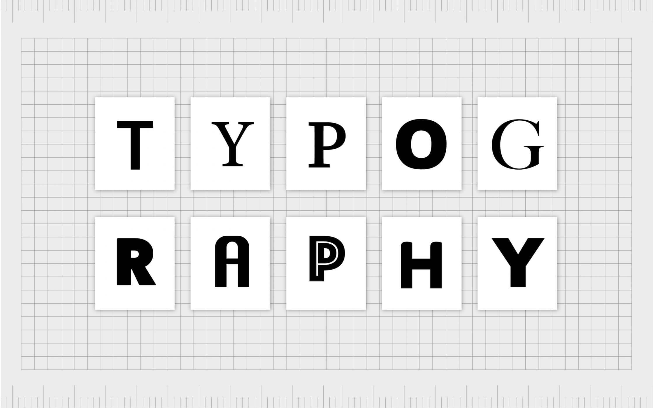
A lot can be captured through the style of your brand’s typography, and it can even be used to convey the personality of your company. Your copy should be captivating, but the visual aspects of any writing also need to stand out to a potential customer. Begin your typography psychology analysis with looking at the style of your font- Is it a classic serif style? These include Baskerville, Georgia and Times New Roman, this category is timeless and professional, finished with traditional decorative lines and they convey an air of respectability. The sans serif choices such as Helvetica, Arial and Verdana are more straight to the point, implying an air of modernity and stability. Artsy handwriting can look elegant and represent creativity, and to create this kind of image you’ll need a script font such as Lebster or Lucinda; but, it’s always important to keep it legible and consider it in relation to the message you want to get across. For example, a sport clothing website with joined up handwriting style typography wouldn’t look quite right, but perhaps fine dining eateries’ first port of call for menu printing wouldn’t be Comic Sans MS. If you want to go all-out 21st century modern, choose Eurostyle, Politica or Futura, and show your audience why you are at the forefront of your industry with progressive typography. Your font will contribute to your overall typography aesthetic, and it should result in a well-rounded, on-brand appearance. Maintaining this is also important, as failure to keep order among your typography can make your customer feel disconnected from your brand, as cluttered, numerous fonts dilute your overall presence.
The formatting of your typography can be make or break for your success
As Spanish fashion retailer Zara recently discovered, the formatting of your typography can make or break your success. The brand gave their classic logo a refresh, dramatically condensing the exaggerated sans letters and introducing a bolder, rounder finish. The makeover received a staunch response on social media, leaving many with a new-found sense of unfamiliarity towards the brand. The particular format was a style pioneered by Harper Bazaar in the 1990s, but one twitter user likened the new look to how they feel when ‘squeezing into their clothes’; showing how the change in typography provoked a customer response. All achieved by some simple kerning. A similar event caused outcry, as Burberry unveiled a new logo back in 2018, an adaptation which at first glance appeared to ditch historic ties in favour of modern corporate simplicity. The reformat was a four-week project headed up by famed designer Peter Saville, which some people felt was reflected in the hasty, overly-simplistic design. The old format had been untouched for nearly two decades, and its new notions of minimalism brought the brand up to date. Key factors for formatting are spacing and size, as these are essentially going to dictate how ‘readable’ your typography is. Format can be reflective of character, and if there are any particular attributes that you want to associate with your brand, then implementing them into your formatting can be a great idea to help build your unique presence. Also, ensuring that you have enough whitespace is vital, as having too little can make your typography difficult to decipher. The formula for success is simply to strike a balance between these elements, while also staying true to your brand and all it encases.
The first impression of the product generated by colour
When it comes to colour, choosing the right one is key. There is an age-old understanding that customers enjoy red and yellow the most, as they depict both abruptness and warmth simultaneously. In fact, between 62%-90% of first impressions of a product are decided by the colours of the brand, showing just how much they can set the tone. Therefore, colours are an integral part of promoting successful customer journeys. Not only is colour an emotional trigger, it can also be the key for customers to be able to identify your product against others on the market. Some gendered trends have also appeared which could determine your brand’s palette, with men tending to prefer bold colours and women being drawn in by pastel hues. Of course, certain colours have specific associations. Blue is seen as a peaceful colour, and green is a lucky shade — so why not transform the fate of your typography with a splash of either? Black is notoriously corporate and classic, with other connotations including wisdom and masculinity. If you are considering adding a fill to your typography, then choose wisely and always keep in mind that it should not be a challenge for a user to read — there’s a time and a place to go for an all-out rainbow.
So, if you are looking to mix things up a bit, don’t be too hasty. Your typography choices are rooted in many factors, from colour to font style. Find a combination of these which captures your brand name and message in a way which is true to purpose.
Article generated by a leading UK perfect bound books provider, Where The Trade Buys.


